Last updated: March 01, 2026
Aspect Ratio Calculator
The Complete Guide to Aspect Ratios: Everything You Need to Know
From the silver screen to your smartphone, aspect ratios quietly shape every visual experience — here’s how to master them completely.
Every screen you have ever looked at — from a crumbling 1950s television to the latest iPhone — is defined by a single, deceptively simple relationship: the ratio of its width to its height. We call this the aspect ratio. It determines whether a video feels intimate or cinematic, whether a social media post fills the screen or floats awkwardly in a sea of black bars, and whether a printed photograph looks correct when it comes out of the lab. Understanding aspect ratios is not merely a technical exercise. It is a fundamental skill for anyone who creates, shares, or works with visual content.
This guide will take you from the absolute basics — what an aspect ratio actually is and how the math works — all the way through the history of visual media, the practical standards used by YouTube, Instagram, Netflix, Hollywood, and print labs, and the common pitfalls that trip up designers and video producers every single day. By the end, you will have a complete, working understanding of one of the most important and most overlooked concepts in visual communication.
What Is an Aspect Ratio? The Core Concept
An aspect ratio is the proportional relationship between the width and height of a rectangular shape, expressed as two numbers separated by a colon. When you see “16:9,” you read it as “sixteen to nine,” and it tells you that for every 16 units of width, the shape is 9 units tall. The actual size is irrelevant — a 320×180 pixel thumbnail and a 7680×4320 pixel 8K television frame are both 16:9. The ratio is a proportion, not a measurement.
This distinction is critically important. Aspect ratio and resolution are completely different things that are often confused. Resolution refers to the total number of pixels — how much information is packed into the frame. Aspect ratio refers only to its shape. A 16:9 video can be 480p, 720p, 1080p, or 4K — they all have the same rectangular shape, just increasing amounts of detail.
The noation can also be expressed as a single decimal number — often called the decimal ratio or ratio value — by simply dividing the width by the height. A 16:9 ratio equals approximately 1.778:1. This decimal form is particularly common in the film industry, where you might hear a director say a film was “shot in 2.39” rather than “shot in 2.39:1.” Both refer to the same thing: a screen that is 2.39 times wider than it is tall.
The Mathematics Behind Aspect Ratios
The math of aspect ratios is elegant and relatively simple once you see the pattern. Every calculation comes back to one core formula: width divided by height equals the ratio value. From this single relationship, you can derive any missing dimension as long as you know two of the three variables.
Ratio = Width ÷ Height Height = Width ÷ Ratio Width = Height × Ratio
Simplified Ratio: divide both W and H by their GCD e.g. 1920 ÷ GCD(1920,1080) = 16 | 1080 ÷ GCD(1920,1080) = 9
To simplify a ratio to its smallest whole numbers, you use the Greatest Common Divisor (GCD) — the largest number that divides evenly into both the width and the height. For 1920×1080, the GCD is 120. Dividing both numbers by 120 gives 16 and 9, confirming the familiar 16:9 ratio. For less common resolutions like 2560×1080 (an ultra-wide monitor resolution), the GCD is 40, giving the simplified ratio of 64:27 — though in practice, this is almost always written as its decimal approximation of 2.370:1.
Some ratios cannot be perfectly simplified into small, neat integers. The golden ratio — approximately 1.618:1 — is an irrational number and cannot be expressed as a ratio of small whole numbers at all. Similarly, cinema formats like 1.85:1 and 2.39:1 are always written in decimal form because their whole-number equivalents (like 370:200 or 239:100) are too large to be practical or meaningful.
“Knowing the ratio means knowing the shape. Knowing the resolution means knowing the detail. You need both — but they are not the same thing.”
A useful concept related to aspect ratios is the diagonal relationship. Because width and height form a right angle, you can calculate the diagonal of any rectangular frame using the Pythagorean theorem. This becomes important when calculating pixel density (PPI — pixels per inch), which tells you how sharp a display looks at a given physical size. A 27-inch 4K monitor and a 5-inch smartphone screen might both display 1080p content, but the smartphone’s much smaller physical size produces a dramatically higher PPI, resulting in a sharper, more detailed-looking image.
A Brief History: From Film Reels to Retina Displays
The story of aspect ratios is really the story of evolving technology battling audience expectation. It begins in the late 19th century, when Thomas Edison and W.K.L. Dickson established the first standard film frame at 35mm — a format that implied a width-to-height ratio of approximately 1.33:1, which later became codified as the 4:3 ratio that would define visual media for the next half century.
This 4:3 ratio felt natural and stable. It loosely mimics the roughly square field of human binocular vision and felt comfortable in the early silent film era. When television was invented in the 1930s and 1940s, engineers adopted the same 4:3 ratio because television was meant to bring the cinema experience into homes — and 4:3 was what cinema looked like at the time.
Then came the 1950s, and Hollywood felt an existential threat from television. Why would audiences pay for a cinema ticket when they could watch for free at home? The industry’s answer was spectacle — and spectacle meant wider screens. Between 1952 and 1955, a dizzying array of widescreen formats launched: Cinerama (2.59:1), CinemaScope (2.35:1), VistaVision (1.85:1), and Todd-AO (2.20:1). The intention was simple: give audiences something they absolutely could not get on their boxy 4:3 televisions at home.
These formats eventually consolidated into two primary cinema standards that persist to this day: the “flat” format at 1.85:1, used for comedies, dramas, and dialogue-heavy films, and the anamorphic “scope” format at 2.39:1, used for epic, visually sweeping blockbusters. Walk into any modern multiplex and you will still see films projected in one of these two ratios.
The next seismic shift came in the late 1980s and 1990s, when the HDTV standard was being developed. Engineers at the Society of Motion Picture and Television Engineers (SMPTE) chose 16:9 as the new television standard — a deliberate compromise that could display both 4:3 and widescreen cinema content with manageable black bars on either side. This 16:9 ratio was mathematically calculated by Dr. Kerns H. Powers to be the geometric mean of all the common widescreen film formats, making it the optimal compromise shape for a single screen expected to handle multiple content types.
The Most Important Aspect Ratios and What They Mean
| Ratio | Decimal | Name | Primary Use |
|---|---|---|---|
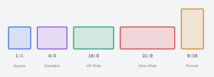
| 1:1 | 1.000 | Square | Instagram, icons, album art |
| 4:3 | 1.333 | Fullscreen / Standard | Legacy TV, iPad, older monitors |
| 3:2 | 1.500 | Classic Photo | 35mm film, DSLR cameras, MacBook display |
| φ:1 | 1.618 | Golden Ratio | Art, architecture, design composition |
| 16:9 | 1.778 | HD Widescreen | YouTube, Netflix, TV, most monitors |
| 1.85:1 | 1.850 | Cinema Flat | Hollywood dramas and comedies |
| 2.39:1 | 2.390 | CinemaScope / Anamorphic | Hollywood blockbusters |
| 21:9 | 2.333 | Ultra-Wide | Ultra-wide gaming monitors |
| 9:16 | 0.563 | Vertical Video | TikTok, Instagram Stories, Reels, Shorts |
| 4:5 | 0.800 | Portrait Social | Instagram feed portrait posts |
Aspect Ratios in Video and Streaming
Modern video production is dominated by 16:9, and for good reason. It is the official aspect ratio of HD and Ultra HD television, the native format of YouTube, Netflix, Disney+, Apple TV+, and virtually every other streaming platform. When you record video on a modern smartphone held horizontally, a DSLR, a mirrorless camera, or a professional video camera, you are almost certainly capturing in 16:9 by default. It has become so ubiquitous that for most practical purposes, “video” and “16:9” are synonymous.
However, the vertical video revolution has significantly complicated this picture. The rise of TikTok, Instagram Reels, YouTube Shorts, and Snapchat has made 9:16 — the exact inverse of 16:9 — a dominant format for a massive audience, particularly younger viewers who consume content primarily on smartphones held vertically. For content creators and brands, this means producing content in two completely different aspect ratios simultaneously has become the norm rather than the exception.
Streaming Platform Quick Reference
YouTube recommends uploading at 16:9 with a minimum of 1280×720. Netflix requires at least 1920×1080 for HD originals and 3840×2160 for 4K content. TikTok and Instagram Reels are 9:16 (1080×1920). YouTube Shorts are also 9:16. Twitter/X crops to roughly 16:9 in the feed but supports other ratios in full view.
Cinema presents an entirely different set of considerations. Films are shot in either the 1.85:1 flat format or the 2.39:1 anamorphic scope format, and directors and cinematographers care deeply about which they choose. The wider 2.39:1 format creates a horizontal, panoramic feeling that emphasizes landscape, scale, and epic action — think the desert sequences in Lawrence of Arabia or the battle scenes in Dune. The 1.85:1 format feels more intimate and contained, better suited to character studies and dialogue-driven dramas.
Aspect Ratios in Photography
Photography has its own distinct aspect ratio traditions rooted in the physical dimensions of film formats. The most influential of these is 3:2, which comes from the 35mm film frame measuring 36×24 millimeters. When digital cameras were designed to replace 35mm film cameras, engineers replicated this exact ratio in the digital sensor — which is why virtually every DSLR and most mirrorless cameras shoot in 3:2 by default.
The 3:2 ratio sits in an interesting middle ground: wider than the boxy 4:3 of older displays, but more contained and intimate than the cinematic sweep of 16:9. It has a long and comfortable relationship with portrait photography because its slight verticality when held in portrait orientation provides natural headroom above a subject while still feeling spacious and composed.
Medium format photography uses a range of ratios depending on the film size, including 1:1 (from the iconic Hasselblad square format beloved by photographers like Ansel Adams and Irving Penn), 6:7, and 6:4.5. These unusual ratios are partly why square photography has such strong associations with fine-art and fashion photography — it was the format of the prestige camera.
Aspect Ratios in Social Media and Digital Marketing
Social media has created an extraordinarily fragmented landscape of aspect ratio requirements, and failing to account for these differences is one of the most common and costly mistakes made by marketing teams and content creators. Each platform has specific recommendations, and images that look perfect in one format can appear awkwardly cropped, surrounded by ugly black bars, or stretched beyond recognition on another.
Instagram alone requires creators to think about at least three separate ratios: 1:1 for square feed posts (which takes up more vertical space on mobile feeds, increasing engagement), 4:5 for portrait feed posts (the maximum Instagram supports in the feed, giving the most screen real estate on a phone), and 9:16 for Stories and Reels. The 4:5 portrait ratio is particularly important and often overlooked — it is not a “natural” ratio derived from any camera sensor or screen standard, but rather a format specifically engineered by Instagram to maximize mobile screen coverage in the feed.
Facebook and LinkedIn both favor the Open Graph image standard of approximately 1.91:1 (1200×630 pixels) for link preview images. This ratio was chosen because it fills a wide landscape card reasonably well across both desktop and mobile feed layouts. Twitter/X crops images to roughly 16:9 in the timeline but displays the full image when clicked, which creates a design challenge: key information needs to be in the central portion of the image for the cropped preview, while the full image should look intentional and complete at its native ratio.
Letterboxing, Pillarboxing, and Cropping Explained
Whenever content designed for one aspect ratio is displayed on a screen with a different aspect ratio, something has to give. There are three fundamental approaches, each with significant trade-offs: letterboxing, pillarboxing, and cropping.
Letterboxing is what happens when wide content is displayed on a taller screen. The video is scaled to fit the full width of the display, but since it is not tall enough to fill the height, black bars appear at the top and bottom. The name comes from the shape of a traditional postal letterbox slot — a wide horizontal opening. If you have ever watched a widescreen film on an older 4:3 television, you have seen letterboxing. The same phenomenon occurs when 16:9 YouTube videos appear with black bars on a 9:16 phone screen held vertically.
Pillarboxing is the opposite: tall content displayed on a wider screen, creating black bars on the left and right sides. This occurs when older 4:3 content is played on a modern 16:9 screen. Many television channels that broadcast old content — classic sitcoms, archival sports footage, vintage films — pillarbox the content to preserve its original framing, though some broadcasters controversially stretch the image to fill the screen instead, creating the distorted, unnaturally wide appearance that many viewers find deeply objectionable.
Stretching video to fill an incompatible aspect ratio distorts faces, makes circular objects appear oval, and destroys the compositional intent of the original filmmaker or photographer. Always use letterboxing, pillarboxing, or intelligent cropping. Your audience will notice — and judge accordingly.
Cropping — sometimes called “zooming to fill” or using the CSS/video property “object-fit: cover” — fills the entire screen by scaling the content until it fills both dimensions, then cutting off whatever extends beyond the frame. This eliminates black bars entirely but sacrifices content at the edges. When done carelessly, cropping can cut off heads in portrait photography, remove crucial context from documentary footage, or eliminate subtitles that were composed for the edges of a widescreen frame.
Pixel Density, Print, and the DPI Connection
Aspect ratio and resolution interact most concretely when you are printing an image or determining how sharp a screen looks. The key metric is DPI — dots per inch for print, or PPI — pixels per inch for screens. Both measure how much information is packed into each inch of physical space, and the aspect ratio of your image directly determines what physical sizes are available at any given DPI.
For professional print, 300 DPI is the gold standard. At 300 DPI, a 3000×2000 pixel image (a 3:2 ratio with 6 megapixels) can be printed at exactly 10×6.67 inches with no quality loss. If you try to print the same image at 12×8 inches, you drop to 250 DPI — still acceptable for most purposes, but beginning to show softness under close inspection. At 20×13.3 inches, you are at 150 DPI, which looks acceptable from normal viewing distance but will appear noticeably soft up close. Understanding this relationship prevents the all-too-common disaster of commissioning a large-format poster only to discover the supplied image is too low-resolution to print crisply.
Screen PPI follows similar logic but with different thresholds. Desktop monitors typically operate between 90 and 110 PPI and look sharp because they are viewed from 20–30 inches away. Smartphone displays — viewed at 10–12 inches — need 300 PPI or more to appear sharp, which is why Apple’s “Retina” displays (250+ PPI) look noticeably crisper than standard displays. The aspect ratio of a device’s screen, combined with its physical diagonal size and resolution, determines its PPI precisely.
How to Choose the Right Aspect Ratio for Your Project
Choosing the right aspect ratio starts with a simple question: where will this content be primarily viewed? If the answer is “on a standard television or computer monitor,” 16:9 is almost always correct. If the answer is “on a smartphone, specifically in a vertical feed,” 9:16 is your target. If the answer is “in print,” you need to work backwards from the print dimensions and margin requirements to determine the ratio that fits your layout.
For social media, the choice has strategic implications beyond aesthetics. Taller formats take up more screen space in scrolling feeds, which generally increases engagement because they occupy more of a viewer’s attention before they scroll past. The 4:5 portrait format on Instagram is not just an option — for many content types, it is measurably the highest-performing format in terms of reach and engagement, simply because it fills more of the phone screen.
For video production destined for multiple platforms, the industry best practice is to shoot at the widest required ratio (typically 16:9 or even wider) and then design the composition to work when cropped to the narrowest required ratio (typically 9:16). This “safe zone” approach — keeping all critical visual information and titles in the central square of a 16:9 frame — allows a single shoot to produce content for both horizontal and vertical platforms without reshooting.
Common Mistakes and How to Avoid Them
The most prevalent aspect ratio mistake in digital media is uploading square or portrait images to platforms that display them at 16:9, leading to automatic cropping that cuts off faces, text, and key visual elements. Always check the specific requirements of every platform before exporting final assets, and always preview how your image will appear in the platform’s cropped thumbnail view before publishing.
A second common error is confusing aspect ratio with resolution when briefing designers, photographers, or video producers. Requesting “a 16:9 image” tells a designer the shape but nothing about the size — a 640×360 pixel image is technically 16:9, but it is completely unsuitable for a billboard or a television broadcast. Always specify both the ratio and the minimum resolution in pixels.
A third mistake, particularly in web design, is allowing images to reflow freely without specifying their aspect ratio in CSS. When an image loads slowly or fails to load, the page can “jump” as space is allocated — a phenomenon called Cumulative Layout Shift (CLS), which Google measures as a Core Web Vital. Modern CSS provides the `aspect-ratio` property specifically to address this, allowing developers to reserve the correct amount of vertical space before the image loads.
The Future of Aspect Ratios
Aspect ratios are evolving in ways that would have seemed extraordinary just a decade ago. Foldable smartphones, like the Samsung Galaxy Z Fold series, can display content at one aspect ratio when closed and a dramatically different ratio when unfolded. Augmented reality and virtual reality headsets present content in immersive, near-spherical fields of view that have no meaningful “aspect ratio” in the traditional sense. Flexible LED displays can be manufactured in virtually any shape, and automotive displays are increasingly designed as dramatic horizontal strips with extreme wide ratios.
Artificial intelligence is also changing how content adapts across aspect ratios. “Smart cropping” algorithms — already deployed by Google Photos, Adobe, and most major CDN providers — analyze image content to identify faces, focal points, and compositional elements before automatically cropping to fit any target ratio. Rather than blindly cutting from the edges, these systems preserve what matters most. As AI capabilities grow, the manual work of creating multiple versions of content for different platforms will increasingly be automated, though the underlying logic of aspect ratios — the fundamental geometry of screens — will remain as relevant as ever.
Whether you are a filmmaker choosing between flat and scope, a social media manager optimizing posts for maximum feed coverage, a web developer preventing layout shifts, or a photographer ordering prints, aspect ratios are the invisible architecture of every visual experience. They are one of the oldest and most enduring standards in visual technology — a simple ratio of two numbers that shapes everything you see.
An aspect ratio is the proportional relationship between a rectangle's width and its height, written as two numbers separated by a colon — for example, 16:9. It describes the shape of a frame, nothing more. A 320×180 pixel thumbnail and a 7680×4320 pixel 8K television screen are both 16:9, because their shape is identical even though their sizes are radically different.
Resolution, by contrast, describes the amount of information packed into that shape — the total pixel count. Two images can share the exact same aspect ratio but be completely different resolutions, and two images can share the same resolution but have entirely different aspect ratios.
The 16:9 ratio was not an accident — it was a deliberate mathematical compromise. In the late 1980s, Dr. Kerns H. Powers at SMPTE (the Society of Motion Picture and Television Engineers) was tasked with finding a single aspect ratio that could display the widest range of existing film and TV formats with the smallest black bars possible.
He calculated the geometric mean of all the major formats in use at the time — 4:3 (standard TV), 1.85:1 (cinema flat), and 2.39:1 (cinema scope) — and arrived at approximately 1.777:1, which simplifies neatly to 16:9. It is not a perfect fit for any single format, but it is the optimal compromise that minimises wasted screen space across all of them.
There are three core formulas, and you only need to memorise one relationship: Width ÷ Height = Ratio Value. From that, the other two follow naturally.
| You Know | You Want | Formula |
|---|---|---|
| Width + Ratio | Height | Height = Width ÷ Ratio |
| Height + Ratio | Width | Width = Height × Ratio |
| Width + Height | Ratio | Ratio = Width ÷ Height |
For example, to scale a 1920×1080 (16:9) image to a new width of 1280: Height = 1280 ÷ (16/9) = 1280 ÷ 1.778 = 720px. To simplify any ratio to its smallest whole numbers, divide both values by their Greatest Common Divisor (GCD).
All three are methods of displaying content at one aspect ratio on a screen with a different aspect ratio. Each makes a different trade-off between showing all the original content and filling all the available screen space.
| Method | What It Does | Trade-off |
|---|---|---|
| Letterbox | Fits wide content onto a taller screen; black bars top & bottom | No content lost, screen not filled |
| Pillarbox | Fits tall content onto a wider screen; black bars left & right | No content lost, screen not filled |
| Crop / Fill | Scales up until screen is filled, cuts off edges | Screen filled, edges of content lost |
| Stretch | Distorts image to fill the screen | ⚠️ Never recommended — destroys proportions |
Each platform has specific requirements, and using the wrong ratio results in automatic cropping, black bars, or reduced reach. Here is the complete breakdown:
| Platform / Format | Ratio | Recommended Size |
|---|---|---|
| YouTube Video | 16:9 | 1920×1080 (min), 3840×2160 (4K) |
| YouTube Shorts | 9:16 | 1080×1920 |
| Instagram Feed Square | 1:1 | 1080×1080 |
| Instagram Feed Portrait | 4:5 | 1080×1350 |
| Instagram Story / Reel | 9:16 | 1080×1920 |
| TikTok Video | 9:16 | 1080×1920 |
| Twitter/X Feed Image | 16:9 | 1200×675 |
| Facebook / LinkedIn Post | 1.91:1 | 1200×630 |
The 3:2 ratio comes directly from the physical dimensions of 35mm film: each frame measures exactly 36×24 millimetres, which is a 3:2 proportion. When digital cameras were designed as replacements for 35mm film cameras, engineers replicated this exact sensor shape — and so the 3:2 ratio became the default for the vast majority of DSLRs and mirrorless cameras to this day.
This matters practically because 3:2 does not perfectly match any standard screen ratio. A 3:2 photo displayed on a 16:9 monitor will always have thin horizontal black bars, and a 3:2 photo posted to an Instagram square format will always be cropped. Photographers need to be aware of their final output format when composing shots — leaving intentional room for cropping in the areas that different platforms will cut.
Aspect ratio determines the shape of your print. DPI (dots per inch) determines the quality. Together, they define what size you can print without visible degradation. The formula is simple: print dimension in inches = pixel dimension ÷ DPI.
| DPI | Quality Level | Best For |
|---|---|---|
| 72 DPI | Screen only | Web display, email |
| 96 DPI | Screen only | Windows screen standard |
| 150 DPI | Draft print | Large-format banners, viewed from distance |
| 300 DPI | Professional print | Photos, magazines, business cards |
| 400–600 DPI | Ultra-high quality | Fine art prints, archival reproduction |
The golden ratio — approximately 1.618:1, denoted by the Greek letter φ (phi) — is a mathematical proportion found throughout nature, architecture, and art for millennia. It describes a rectangle where, if you remove a square from one end, the remaining rectangle has the same proportions as the original. This property gives it a self-similar, visually "complete" quality that many people find inherently pleasing.
Whether it truly matters in design is a more nuanced question. Many famous works of art and architecture are claimed to follow the golden ratio, but rigorous analysis often finds these claims exaggerated. What is genuinely true is that the golden ratio falls very close to 3:2 (1.500) and 16:10 (1.600), and both of those formats have long track records of feeling natural and balanced to human viewers.
Modern Hollywood films use one of two primary formats, and cinematographers choose between them as a deliberate artistic decision — not a technical default.
| Format | Ratio | Feel & Usage |
|---|---|---|
| Cinema Flat | 1.85:1 | Intimate, contained. Dramas, comedies, dialogue-heavy films. More vertical space for faces. |
| Anamorphic Scope | 2.39:1 | Epic, panoramic. Action, sci-fi, westerns. Emphasises horizontal scale and landscape. |
| Classic Scope | 2.35:1 | Legacy format from CinemaScope era; still used by some directors for its heritage look. |
| IMAX | 1.43:1 | Near-square. Used for specific sequences in blockbusters for maximum immersion. |
Directors like Christopher Nolan and Quentin Tarantino have famously strong preferences — Nolan shoots key scenes in IMAX (1.43:1) to maximise scale, while Tarantino shot The Hateful Eight in Ultra Panavision 70 at 2.76:1, one of the widest ratios ever used commercially.
The professional answer is a technique called safe zone composition. The idea is to shoot or design at the widest required ratio, but keep all critical elements — faces, text, logos, key action — within a centred zone that survives cropping to the narrowest required ratio.
For video production targeting both 16:9 (YouTube, TV) and 9:16 (TikTok, Reels), the safe zone is a centred vertical strip that fits within both formats. If you keep all essential content within the central square of your 16:9 frame, that content will survive the crop to 9:16 with nothing important cut off. This is sometimes called the "Centre Frame" or "Reframe" technique.
For photography, shoot with extra space around your subject — "give yourself room to crop" is the universal advice. Shooting at a higher resolution also helps, as it allows more aggressive cropping while still maintaining sufficient pixels for the target platform's resolution requirements.
Enter one size, get a full set of common resolutions maintaining your exact ratio.
Compare two aspect ratios side-by-side with visual bars and detailed metrics.
Calculate black bars, crop amounts, and fit/fill options when converting between ratios.
Explore standard resolutions and ratios for popular platforms and devices.
Find the ideal print size for your image at various DPI settings.
Browse all major aspect ratios with their use cases, decimal values, and common resolutions.